







Have you ever finished a watercolor painting, stepped back, and thought… why does this look flat? The colors are pretty. The shapes are fine. But something about it just isn't working. Nine times out of ten, the culprit is values. Or rather, not paying enough attention to them.
This summer, we're fixing that. Consider this your official summer watercolor challenge: learn to paint with values, and watch your work go from pretty to dimensional.
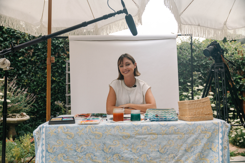
Hey friend! I'm Jenna Rainey, self-taught watercolor artist, best-selling author of the Everyday Watercolor book series, and someone who is genuinely hell-bent on teaching everyone how to find their inner creative voice. If you're new here, I've been teaching watercolor since 2012 through YouTube videos, online courses, and books.
If you want a solid foundation before diving into this post, grab my free 40-page beginner's e-book, it covers everything from supplies to color theory and it's completely free.
Now, let's talk painting with values.
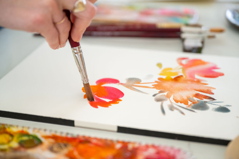
What Does “Painting with Values” Actually Mean?
In art, value is just how light or dark something is. That's it. It has nothing to do with how “good” your painting is (I know, confusing name).
A full value scale runs from pure white (the lightest light) all the way down to your deepest, darkest dark. Everything in between is a midtone. When you're painting with values, you're consciously choosing where things fall on that scale before and while you paint.
I teach this through what I call the Tea-to-Butter scale, which maps directly to how much water you're using with your paint:
- Tea: Super watery, very light. Soft washes, backgrounds, first layers.
- Coffee/Milk: Middle values. Most of your painting lives here.
- Cream: Richer, less water. Colors feel bolder and start to lose some transparency.
- Butter: Almost no water. This is for your darkest darks, final details, and textured marks.
Understanding where you are on this scale at any given moment is painting with values. It sounds simple, and honestly it kind of is, but it takes real practice to internalize.
For a deeper look at how this connects to color mixing, this post on color mixing for beginners breaks it all the way down. Or you can watch it all in action below.
Why Painting with Values Is the Secret to Depth
Here's something that took me a while to fully accept: value matters more than color.
A painting with strong values will read well even in black and white. A painting with beautiful colors but weak values will still look flat. The values are what create the illusion of light, shadow, and three-dimensional form on a two-dimensional piece of paper.
The easiest way to test this is the squint test. Squint at your reference photo or subject until your eyes blur a little. What disappears? What stands out? The shapes that pop are your lightest lights. The shapes that sink are your darkest darks. That contrast (that difference between the two) is where depth lives.
I go deep on color theory and value relationships in my color theory video below, where we actually paint a value scale together.
The Most Common Value Mistake Beginners Make
I see this constantly, and honestly I've done it myself more times than I'd like to admit: going too dark too fast.
You're excited. You want the painting to look dramatic and dimensional right away. So you reach for that deep, rich pigment in the first five minutes and lay it down. Then you realize you've got nowhere to go. You can't paint white back over watercolor. That dark is there.
Watercolor is a light-to-dark medium. Always. You have to save your lights by leaving them alone early on. The darks come last.
A few other common mistakes when painting with values:
- Painting wet layers over wet layers without letting them dry. This creates blooms and bleeds that you didn't plan for and can muddy your values.
- Skipping midtones entirely. Jumping from super light to super dark with nothing in between makes paintings feel harsh instead of dimensional.
- Treating all your shadows as the same value. Shadows have variation. Some edges are soft, some are sharp. Some areas are darker than others.
How to See Values Before You Start Painting
Before your brush touches the paper, you need a value roadmap. This doesn't have to be fancy or take a long time.
Two methods that actually work:
1. The squint test (already mentioned, but use it here too): Squint at your reference until details blur and you're only seeing light and dark shapes. Make a mental note of where the lightest and darkest areas are. That's your map.
2. A quick grayscale value sketch: Take 2–3 minutes with a pencil and sketch the basic shapes of your composition, shading in approximate values. You don't need it to look good. You just need to know: where are my lights? Where are my darks? Where are my midtones?
This planning step is the thing most beginners skip, and it's the reason a lot of paintings feel unresolved. I go into this in detail in my post on painting watercolor light to dark, highly recommend reading that one alongside this.
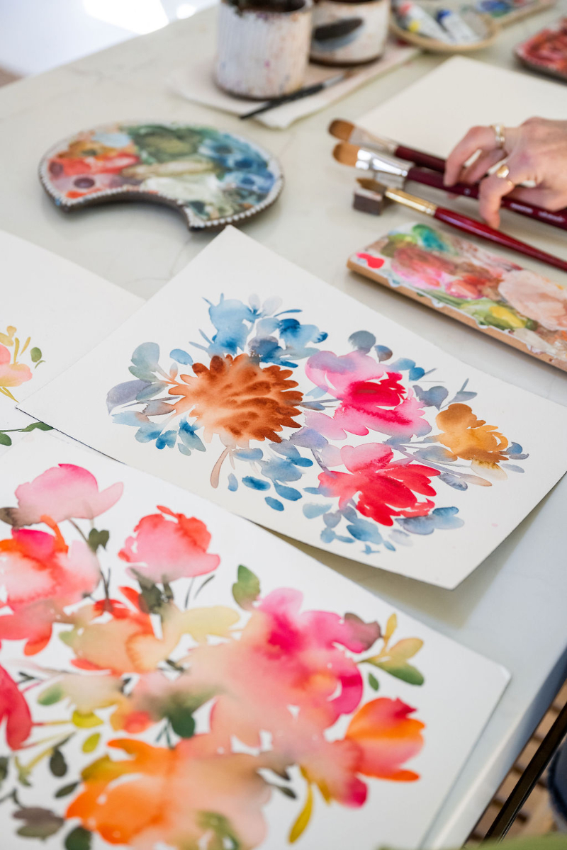
Painting with Values Step-by-Step (Light to Dark)
This is the actual process. Follow these steps and you'll feel the difference immediately.
Step 1: Start lighter than you think you should.
Your first wash should be your lightest value. This wash sets the tone for the whole painting and preserves your highlights. If you think you've gone light enough, go even lighter.
Step 2: Let it dry. Fully. Not “pretty dry.” Fully dry. Touch the paper. If it's even slightly cool to the touch, it's still wet. Adding paint now will cause blooms you didn't ask for.
Step 3: Add your midtones. This is where most of the painting happens. Build in the medium values, the areas where form curves away from the light, where objects start to get some shadow. Still Tea-to-Coffee territory on the scale. Let this layer dry too.
Step 4: Add deeper midtones and shadow areas. We're moving into Cream territory now. These layers start to create real dimension. You're defining edges, adding cast shadows, and making light feel like light by surrounding it with darker values.
Step 5: Finish with your darkest darks, sparingly. Butter consistency. A little goes a long way. These final marks are what make the painting pop. Don't overdo it.
If you want to work through this process in a guided, structured way, my Everyday Watercolor Companion Course covers value, layering, and wet-on-dry technique in depth, with me walking you through it on video.
How to Use Value Contrast to Create a Focal Point
Here's the thing about painting with values that goes beyond just “make it look 3D”: value contrast tells your viewer where to look.
Your eye naturally goes to the area of highest contrast in a painting. Where the lightest light meets the darkest dark. So if you want someone's eye to land on a flower center, a face, a shell, the horizon, that's where you put your strongest contrast. Everywhere else, you keep the values closer together, softer, less dramatic.
This is how painters direct attention without words. It's intentional. It's controlled. And once you understand it, you'll start seeing it everywhere. In paintings you admire, in photographs, in nature.
A quick test: look at one of your recent paintings and find where the strongest value contrast is. Is that where you wanted the eye to go? If not, that's your answer for why something feels off.
Want to go even deeper on focal points? I wrote a whole post breaking down exactly what a focal point is and how to use it in your art. Read it here.

Easy Exercises to Practice Painting with Values
Before jumping into the challenge prompts, try these two exercises. They take maybe 20 minutes total and they build the muscle memory you need.
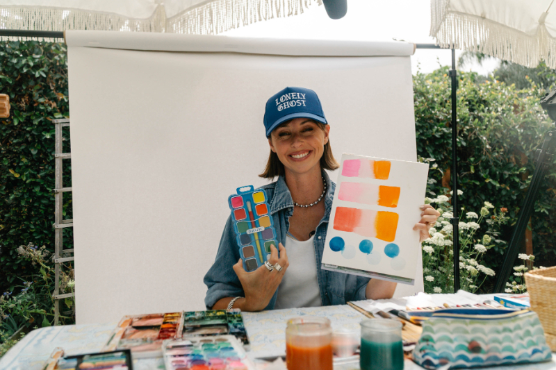
Exercise 1: Paint a 5-step value scale Pick one color. Using just water ratio changes, paint five rectangles from lightest (Tea) to darkest (Butter). No new colors, just the same paint at different dilutions. This alone is one of the most clarifying exercises in watercolor. Do it on scrap paper. Do it ugly. Just do it.
Exercise 2: Single object, three values only Choose something simple. A lemon, a seashell, a mug. Paint it using only three values: light, mid, and dark. No blending, no fancy technique. Just flat shapes of value placed deliberately. This forces you to simplify and make decisions, which is the whole skill.
The Summer Challenge: 5 Painting Prompts Built Around Values
Okay, here's the fun part. These five summer prompts are specifically designed to practice painting with values in a low-pressure, one-session format. Try one a week, or do them all in a weekend. There's no wrong way to do this.
1. Watercolor fruit: Paint a watermelon, banana, and mango with me in this tutorial. Perfect for practicing a clean light-to-dark build.
2. Ocean waves: Light seafoam at the top, deep water below. Natural value gradient built right into the subject. You can paint an ocean landscape with me here. (If you love painting seascapes, my book Everyday Watercolor Seashores also has so many gorgeous projects to pull from.)
3. Sunflowers: Practice using value contrast to make the center sunflower the focal point in this tutorial.
4. A simple landscape: A lively mountain scene with a river running through it, building depth from a light sky wash all the way down to punchy orange foreground trees. (If you love painting landscapes, you should watch my video on the four principles for all landscape paintings next)
5. Loose florals with shadow petals: Paint ten florals with me using value to make some petals recede and others pop. This tutorial is a great challenge if you've been painting flat florals. Everyday Watercolor Flowers is a great companion here.
Share your paintings on Instagram and tag me, I genuinely love seeing your work.
You've Got This
Painting with values is one of those things that feels confusing until it suddenly clicks. And once it clicks, you'll never look at a painting the same way. You'll start seeing light and shadow everywhere. You'll understand why something works, and you'll have actual tools to fix it when it doesn't.
That's the whole point of this challenge. Not to make perfect paintings. To build real skills, one brushstroke at a time.
If you want to keep building on this, start with my free beginner's e-book, it covers value, color theory, supplies, and technique all in one place. And if you're ready to go deeper on layering and value in a video format, come hang out in my Everyday Watercolor Companion Course. I'd love to see you in there.










+ show Comments
- Hide Comments
add a comment