


There's something about a watercolor beach scene that just calls to you. Blue water, blue sky, warm sand. It's one of those subjects that feels exciting to paint from the very first brushstroke.
It's also one where a few specific things tend to trip people up, and once you know what they are, the whole thing clicks.
Water is always moving. Light is always shifting. There's a lot of open space to work with. But those are also exactly the reasons watercolor is such a perfect match for beach scenes. This medium was made for soft edges, fluid color, and that dreamy atmospheric quality you only get at the shore.
You just need to know where to lean in and where to hold back.
Hey friend! I'm Jenna Rainey, a self-taught watercolor artist, educator, and author of the Everyday Watercolor book series. I've been painting coastal scenes for years, and I wrote an entire book about it, Everyday Watercolor Seashores, because the ocean is one of my favorite things to paint. I've also made approximately one million mistakes doing it, which means I know exactly where things can go sideways.
This post walks through the seven most common mistakes I see (and make!) when painting a watercolor beach scene, plus the practical fixes for each one.
If you're brand new to painting water, start with my How to Paint Water in Watercolorpost first, then come back here.

Why Beach Scenes Trip People Up
A watercolor beach scene asks you to juggle a lot at once: sky, water, sand, reflections, waves, and usually some kind of focal point like rocks, a palm tree, or a figure in the distance. That's a lot of variables for one painting.
Water is especially tricky because it's transparent, reflective, and constantly moving. But here's the thing: watercolor is genuinely one of the best mediums for capturing all of that. The way paint bleeds and softens on wet paper? That is water. You just have to let the medium do its job instead of fighting it.
Once you understand these specific mistakes, beach scenes become some of the most satisfying paintings you'll ever make. Meditative, even.
So let's get into it.
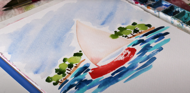
Mistake #1: Making the Sky and Water the Same Color (or Value)
Why it happens: You grab a blue, you paint the sky, then you keep going and paint the water with the same blue. It makes sense in theory since they're both blue. But the result is a painting that reads as one flat wash from top to bottom, with no sense of depth or atmosphere.
The Fix
The sky and the water are related, but they're not the same. The sky is usually lighter and warmer near the horizon. The water in the foreground is deeper and cooler. Breaking them up with value, temperature, and subtle color shifts is what creates that “you are there” feeling.
Try a light gradient wash for your sky: darker at the top, gradually lighter as it approaches the horizon. Then shift to slightly deeper, cooler blues for the water. Wet-on-wet transitions keep everything soft and connected without looking like two separate paintings slapped together.

Mistake #2: Overworking the Water
Why it happens: Water feels unfinished, so you keep adding brushstrokes. More ripples, more texture, more something. And then suddenly it's muddy, overworked, and you're not sure what happened.
The Fix
Watercolor water needs restraint. The fewer strokes, the better. Let wet-on-wet do the heavy lifting for movement and depth, and trust the paint. This is genuinely one of those cases where doing less produces a better result.
Lay in big, confident washes first and let them dry completely. Only add detail like ripples, foam edges, and shadow lines at the very end, and with a much lighter touch than you think you need.
This is exactly what I walk through in my four-part Ocean Landscape Series on YouTube. Check them out below if you want to follow along with actual paint in hand.
Mistake #3: Forgetting About the Horizon Line (or Accidentally Tilting It)
Why it happens: You're deep in painting wave shapes and water texture, and the horizon just drifts. Goes crooked. And once it does, the whole watercolor beach scene feels “off”.
The Fix
Before you touch paint, lightly sketch a horizon line. Decide intentionally where it sits. A good rule of thumb: place it either higher or lower in the composition (the rule of thirds), never dead center unless you're going for a very deliberate, symmetrical look.
- High horizon = more water and foreground interest, smaller sky
- Low horizon = big, dramatic sky, less water
Both are beautiful. But pick one on purpose instead of ending up somewhere in the middle by accident.
Mistake #4: Painting Waves That Look Like Bumps (or Lips)
Why it happens: Waves are hard to observe and even harder to simplify. Most beginners paint what they think a wave looks like: a row of identical arched bumps, evenly spaced. Real waves don't work that way.
The Fix
Waves are overlapping, varied shapes. They have light foam at the crest, darker water beneath, and transparency near the shore where the wave thins out. The key is to focus on just one or two wave shapes and suggest the rest with value and color variation.
Here's a simple approach:
- Leave white paper (or use masking fluid) for the foam at the wave's crest
- Use wet-on-wet for the soft blue-green water beneath it
- Add a thin shadow line below the foam with wet-on-dry once everything is dry
That's it. You don't need to paint every wave. Suggest them and let the viewer's eye do the rest.
If you want to see it in real time, press play on my videos below.
Mistake #5: Using the Wrong Colors for Sand
Why it happens: Sand “looks” beige, so you grab brown or raw sienna and end up with something that looks more like a dirt path than a sun-soaked watercolor beach scene.
The Fix
Beach sand in watercolor is warmer and lighter than most beginners expect. Think golden and peachy, not brown. A warm yellow ochre base is your best starting point. From there, you can add a touch of peach or a very diluted coral toward the waterline where the wet sand picks up a little reflected color from the water.
Keep the wash light and let it stay mostly flat. The sand's job in a watercolor beach scene is to anchor the composition and contrast against the cool water, not to carry a lot of detail or color complexity.
The sand should feel like it belongs in the same painting as the water without competing with it.
Mistake #6: Ignoring Reflections on Wet Sand
Why it happens: Reflections feel like an advanced technique, so beginners skip them. But a flat, dry-looking stretch of sand kills the atmosphere that makes a watercolor beach scene so immersive.
The Fix
Wet sand near the waterline acts like a mirror. It picks up the colors of the sky and water right there in the foreground. And you don't need much: a few loose horizontal strokes in diluted sky and water colors is genuinely all it takes.
Here's the move: While your sand wash is still slightly damp, drop in a diluted version of your water color horizontally near the shoreline. Let it bleed softly into the sand. Then put your brush down and don't touch it. The wet-on-wet effect does all the work.
The reflection doesn't have to be exact or realistic. It just has to suggest that the sand is wet. That's enough.
Mistake #7: Adding Too Much Detail Everywhere
Why it happens: Watercolor beach scenes have a lot of open space, and that space can feel empty or unfinished. So painters try to fill it: every ripple, every shell, every grain of sand. The result is a painting with no focal point and way too much going on.
The Fix
Pick one area of detail. A wave crest, a cluster of rocks, a single palm. Let everything else breathe and stay loose. In watercolor, suggestion beats specification every time.
My golden rule for any watercolor beach scene: lead the eye to one thing, and let the rest be soft and supporting. The foreground doesn't need to be detailed just because it's close. The sky doesn't need texture just because it's large. Edit ruthlessly.
If you want to see this principle in action, the video below is a perfect example.
Now Go Paint One
Now that you know what to watch for, go paint a watercolor beach scene using just one or two of these fixes. Don't feel like you need to apply all seven at once.
Beach scenes can feel hard because they ask you to simplify something that's constantly moving and changing. But that's also what makes them so watercolor. This medium was practically built for capturing light on water, soft horizon lines, and the kind of atmospheric haze that makes you feel like you're standing at the shore.
You're going to paint some beach scenes you don't love. That's fine. But promise me you won’t throw away the “bad” ones. They're teaching you something too.
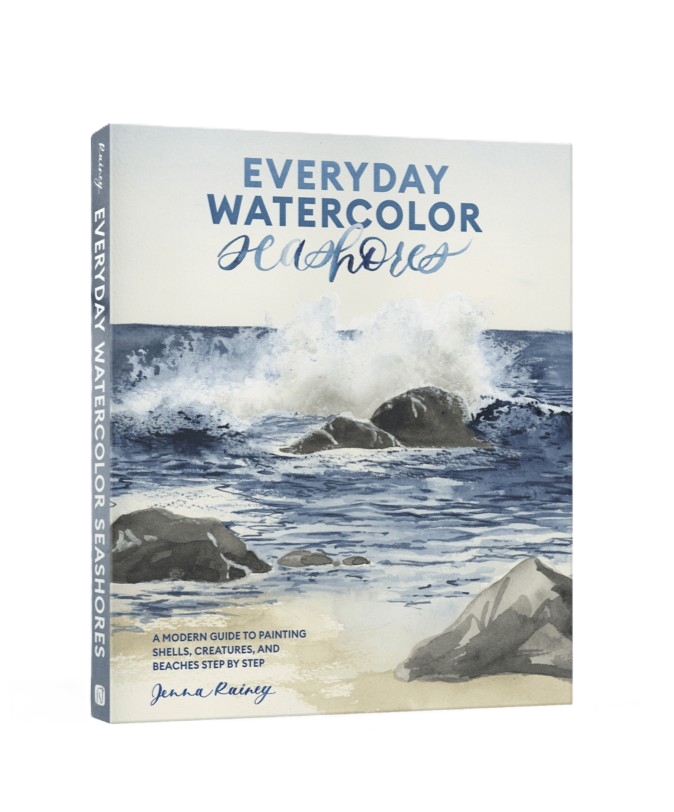
If you want to go deep on coastal painting, don’t forget to check out my book Everyday Watercolor Seashores. It covers everything from shells and sea life to cresting waves and beach landscapes. It's the most thorough thing I've made for ocean painters. Or brighten your space or someone’s day with my Everyday Watercolor Postcards. 100 mini masterpieces ready to mail, gift, or display.

Pass along the bright, beautiful art of Everyday Watercolor with this box of 100 colorful postcards featuring 25 unique designs of gorgeously painted animals and seascapes. Pop a love note in the mail, add a card to a birthday gift, or hang up your favorites by your desk for a daily dose of watercolor inspiration.
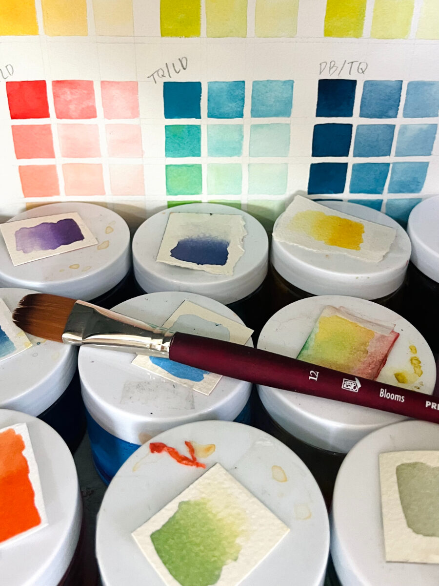
Just getting started with watercolor in general? Grab my free Beginner's Guide to Watercolor e-book. It covers supplies, color theory, core techniques, and everything you need before you ever pick up a brush.
And if you paint a beach scene after reading this, share it. I mean it. Come hang out in my Patreon community where I do live critiques and feedback. I'd genuinely love to see what you make.


+ show Comments
- Hide Comments
add a comment