






You've watched the tutorials, you've mixed the colors, you've done everything the video said to do. And your painting still looks nothing like what's on the screen.
The washes are streaky. The colors look flat and a little dusty. There are hard lines in all the places you wanted soft, dreamy blooms.
So is it you? Or is it your supplies?
Here's my honest answer after testing this myself: sometimes it's both, but it's your supplies way more often than you'd think.
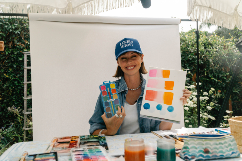
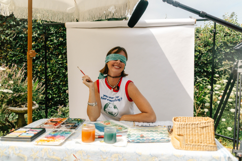
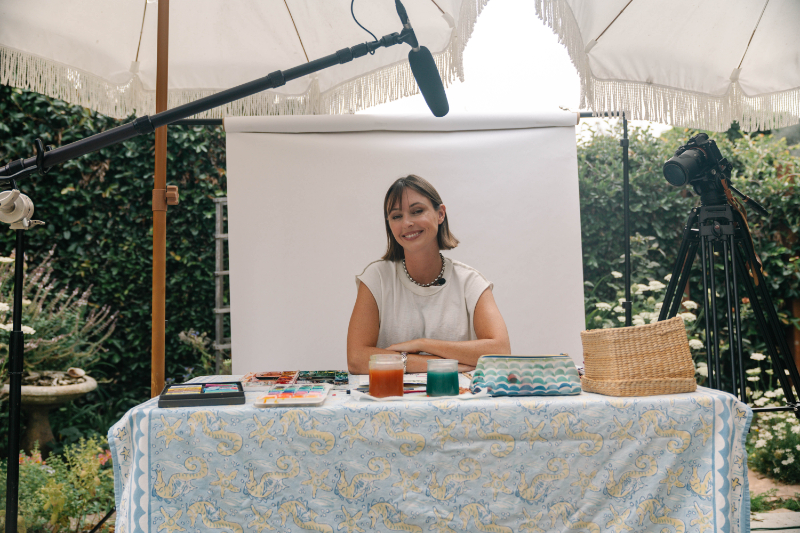
I got tired of guessing, so I ran the comparison properly. Same techniques, same paper, same brush. A $5 student paint set on one side, my professional Maimeri Blu and Winsor & Newton on the other. The differences showed up fast, and a few of them genuinely surprised me. You can watch the whole thing below.
I'm also walking through what that test showed and expanding it into the bigger question the video doesn't have time for: across all your supplies, what actually changes your results, and what matters less than you've been told?
Quick promise before we go: this isn't me talking you into buying expensive everything. It's me helping you understand why your paintings look the way they do, and which single upgrade gives you the most back.
Hey friend, I'm Jenna
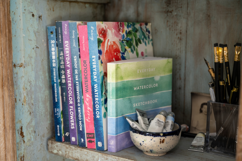
I'm a self-taught watercolor artist, a mom, and a big believer that it's never too late to try something creative. I've taught watercolor to millions of people through YouTube, my courses, and my Everyday Watercolor book series with Penguin Random House. My whole thing is making this stuff feel doable (no art school required, no gatekeeping, no pretending my first paintings weren't rough).

What I Actually Tested (and Why It's a Fair Fight)
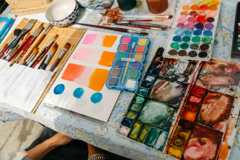
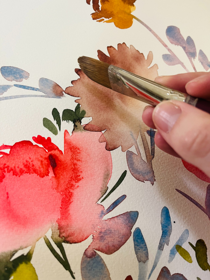
I used the same wet-on-wet technique, the same brush, and the same cold press paper for both sets. That way the only thing changing was the paint itself.
This isn't a lab test with equipment and control groups. It's a studio test, which honestly tells you more. The question I cared about was simple: what would a real person painting at their kitchen table actually notice?
The short version? The $5 set did better than I expected. Cheap paint isn't garbage. But the gaps I found lined up almost perfectly with the frustrations beginners email me about every single week.
Finding 1: Wet-on-Wet Was a Completely Different Experience
This one wasn't close.
With the student paint, I got:
- Cauliflower texture (those spiky, star-shaped blooms that show up when water hits half-dry paint)
- Hard lines forming right where I wanted a smooth gradient
- A grainy, dusty look the second I added water, like the paint was separating instead of blending
With the professional paint, I got:
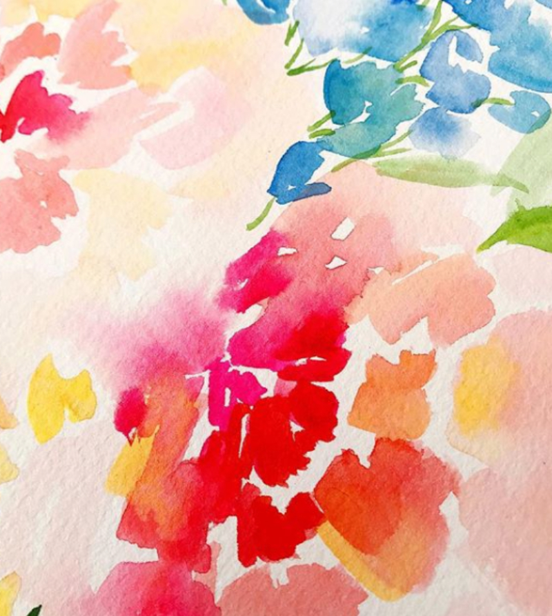
- Smooth, strong pigment bleeds that moved through the water exactly how wet-on-wet is supposed to work
- Clean gradients with no surprise texture
- Paint that cooperated with the water instead of fighting it
Why does this happen?
It comes down to what's inside the tube. Professional paints carry a high load of actual pigment with less filler. More pigment means more color per drop, better flow, and better reactivation when you add water.
Student paints use more filler (things like chalk, dextrin, and extra binder) to keep the price down. That filler doesn't dissolve and travel the way pure pigment does, which is exactly what creates the chalky, grainy behavior. Cauliflower blooms happen when paint dries unevenly, and cheaper paint tends to lose moisture faster and less predictably.
The part I want you to hear
If you've been blaming your technique every time you get a hard line or a weird bloom, it might not be you.
That doesn't get you off the hook for water control (nobody escapes water control, sorry). But you deserve materials that work with your learning instead of against it.
- Want to see what the technique looks like with paint that behaves? → Wet-on-Wet Technique
- Troubleshooting a specific problem? → Watercolor Techniques Cheat Sheet
- Struggling with your water-to-pigment ratio? My Tea to Butter method is here → Color Mixing for Beginners
Finding 2: Vibrancy Was Closer Than I Expected (With One Catch)
I'll be straight with you: the student set didn't embarrass itself on color. The pigments weren't lifeless.
But the professional paints were richer, and they got there with far less effort. To match that intensity with the cheap set, I had to load my brush heavily. And a heavily loaded brush means more water on the paper, which brings back every water control problem from Finding 1.
So the real difference isn't only vibrancy. It's efficiency. Professional paint gives you more color with less paint and less water, which means more control.
There's a longevity piece too. Artist-grade pigments hold up better over time. Student-grade colors are more likely to fade or shift, which matters a lot if you plan to frame anything. (Look for a lightfastness rating of I or II on the tube.)
The fair comparison problem
Here's something worth sitting with. When you compare your painting to a tutorial, you're usually comparing it to work made with professional materials. That's not a level starting line.
Your results aren't lagging because you lack talent. Sometimes you're just holding different tools.
Curious what's actually in your paint? I break down pigment concentration, lightfastness, and artist vs. student grades in The Ultimate Guide to Watercolor Paint.
Finding 3: Your Paper Matters More Than Your Paint
This is the big one, and it's the thing most beginners never hear.
Your paper is the single most important supply you own. More important than your paint. More important than your brushes. My recommendation hasn't changed in years: 100% cotton, cold press, 140lb (300gsm).
Why paper makes or breaks everything
- Cheap paper is wood pulp based, so it soaks up water unevenly. It can't hold pigment where you put it, which is why color bleeds into places you never asked it to go.
- Cotton paper has tooth, a tiny surface texture that grips pigment and lets water travel in a controlled way. That texture is what makes soft gradients possible at all.
- Cheap paper buckles hard when it's wet. Once your surface tilts, water pools in the low spots and you've lost the wash. Cotton paper at 140lb stays much flatter.
- Cold press is the sweet spot. Hot press is slick and gives you less grip. Rough press breaks up your strokes. Cold press sits happily in the middle.
The math that surprises people
A $5 paint set on good paper will beat a $20 paint set on bad paper. Every time.
Yes, cotton paper costs more per sheet. But you burn through way less of it when your sessions actually go somewhere instead of ending in a crumpled ball.
I learned this the hard way. My early supplies were rough: splayed brushes, terrible paper, and paint that behaved more like watered-down acrylic. (I wrote about my paper curling like a potato chip in Watercolor Basics, and I stand by that description.) Upgrading my materials moved my work forward more than any single technique I learned that year.
Ready to go deeper on paper? The Ultimate Guide to Watercolor Paper covers hot vs. cold press, cotton vs. wood pulp, weight, and format.
Where to Spend and Where to Save
The cheap vs professional watercolor conversation usually stops at paint. It shouldn't. Here's my actual hierarchy.
Priority 1: Paper (please don't skimp here)
100% cotton, cold press, 140lb. This is my hill.
Budget tip: buy a block instead of a pad. Blocks are glued on all four edges, so your paper stays flat without taping or stretching, and you lose fewer sheets to warping. Costs more upfront, saves you paper long term.
Priority 2: Paint (a few good colors beat a big cheap set)
You don't need a full professional set on day one. Start with 6 to 8 artist-grade colors in the hues you reach for most, then fill in with student grade for shades you barely touch.
Maimeri Blu is my personal palette, and Winsor & Newton is excellent too. Your two criteria: high pigment concentration and a lightfastness rating of I or II.
On cost: in my studio, a professional tube stretches across many months of near-daily painting. Per session, it's cheaper than the shelf price makes it feel.
Not sure which six to eight colors to start with? I break the whole thing down in How to Build a Watercolor Palette, and the exact tubes I keep restocking are all in one place if you'd rather just grab what I use.
Priority 3: Brushes (two good ones, not ten bad ones)
Cheap brushes shed bristles into your wet paint (a delightful surprise, truly) and refuse to hold a point, so every stroke turns into a negotiation.
A size 6 and a size 16 Princeton Heritage 4050 will handle almost anything you want to paint. They're synthetic, they cost a fraction of natural sable, and they perform beautifully.
Not sure what to look for before you buy? I walk through all of it in my Ultimate Guide to Watercolor Brushes, and the two brushes I reach for almost every single day both show up in My Top 5 Must-Have Art Tools.

“But I'm Just a Beginner. Do I Really Need Good Supplies?”
I get this question in every workshop, and my answer hasn't budged: yes, especially if you're a beginner.
I know that sounds backward. Here's why it isn't.
An experienced painter has enough intuition to work around bad materials. They know when the paper is the problem. You don't have that yet. When you're new, every bad result raises the same unanswerable question: was that my technique or my supplies? Cheap materials make that question impossible to answer, and unanswerable questions are what make people quit.
You don't need everything professional-grade immediately. But chalky paint and warping paper will make learning slower and more discouraging than it needs to be.
My rule of thumb: if you're consistently getting hard lines, unwanted veining, or flat color, treat that as a supplies signal, not just a skill signal.
- Brand new? Start with Getting Started with Watercolor in 7 Steps
- My own early mistakes are all in Watercolor 101: What I Wish I Knew
- More hard-won lessons in 5 Watercolor Lessons I Learned the Hard Way
- And if the sticker shock is the real hangup, I made my full case in Why Is It So Expensive?
Your Upgrade Path (Pick Your Starting Point)
If you're buying your first supplies
- One block or pad of 100% cotton cold press paper (Arches, Legion Stonehenge Aqua, or Fabriano)
- Six to eight professional paint tubes (Maimeri Blu or Winsor & Newton)
- Two brushes: Princeton Heritage 4050 in size 6 and size 16
If you already have supplies
Swap your paper first. It's the change you'll notice immediately.
Then replace paint gradually, upgrading your most-used colors as they run out. And don't toss your cheap paints. They're great for warmups, color charts, and practice sessions where you're testing something rather than making a keeper.
If money is genuinely tight
One block of quality paper plus one set of mid-range paints beats two sets of cheap everything. Paper wins the tiebreak.
Winsor & Newton Cotman (their student line) is a real step up from craft store sets without the full professional price. It's a reasonable bridge.
Want my full list with links? Everything I actually use lives on my favorites page, and I explain the why behind each pick in My Favorite Supplies and Why.
Once your paints arrive, How to Set Up a Watercolor Palette will walk you through getting them organized.
FAQ: Cheap vs Professional Watercolor
Is expensive watercolor paint worth it?
For most painters, yes, but paper deserves your money first. Professional paint gives you stronger color from less pigment, smoother blending, and better fade resistance. If you can only upgrade one thing, upgrade the paper.
What's the difference between student grade and artist grade watercolor?
Pigment load. Artist grade is packed with pigment and minimal filler. Student grade replaces some of that pigment with cheaper fillers, which is why it can look chalky and behave unpredictably with water.
Can beginners use cheap watercolor paint?
Absolutely, for practice. Just pair it with good paper and know that some of your frustrations are coming from the paint, not from you.
Why does my watercolor look grainy or streaky?
Usually filler in student-grade paint, paper that can't hold pigment evenly, or too much water. Test it: paint the same wash on cotton paper and on cheap paper. The difference will tell you a lot.
What watercolor paper should a beginner buy?
100% cotton, cold press, 140lb (300gsm). Arches, Legion Stonehenge Aqua, and Fabriano are all dependable.
Do I need expensive brushes?
No. Two solid synthetics will outperform a ten-pack of cheap brushes and last far longer.

The Real Takeaway
Supplies are tools. They don't replace practice or patience, and no paint set is going to paint something beautiful on your behalf.
What good supplies do is clear obstacles out of your way. And when you're learning, you already have plenty of those. Water control, composition, color mixing, drying times. You shouldn't also be fighting paper that buckles and paint that separates on contact.
So if your paintings aren't turning out how you pictured them, give yourself room to ask whether your materials are part of the story before you decide you just can't do this. I started with genuinely bad supplies. Changing them changed everything.
Watch the comparison, run the test yourself, and then go grab the good paper. (Seriously. The paper.)
Start here:
- Grab my free 40-page Beginner's Guide to Watercolor (it includes my supply recommendations, plus color theory and composition basics)
- New to all of this? Start with Watercolor Supplies 101











+ show Comments
- Hide Comments
add a comment