







Hey friend. You followed the tutorial, you bought the good paper, y0.
ou painted your flowers slowly and carefully, and something still looks off. You just can't name what.
That gap between “this doesn't look right” and “I know exactly why and how to fix it” is the difference between guessing and understanding. Closing that gap is the entire job of an art critique.
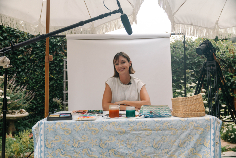
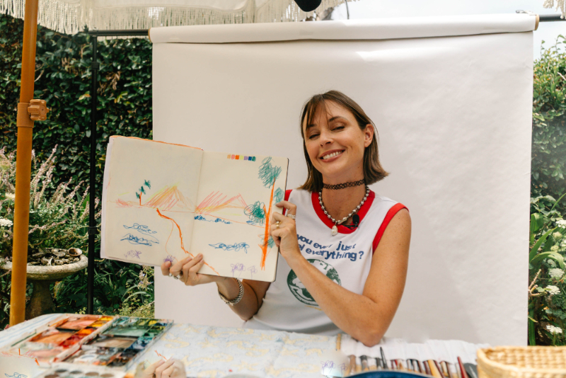
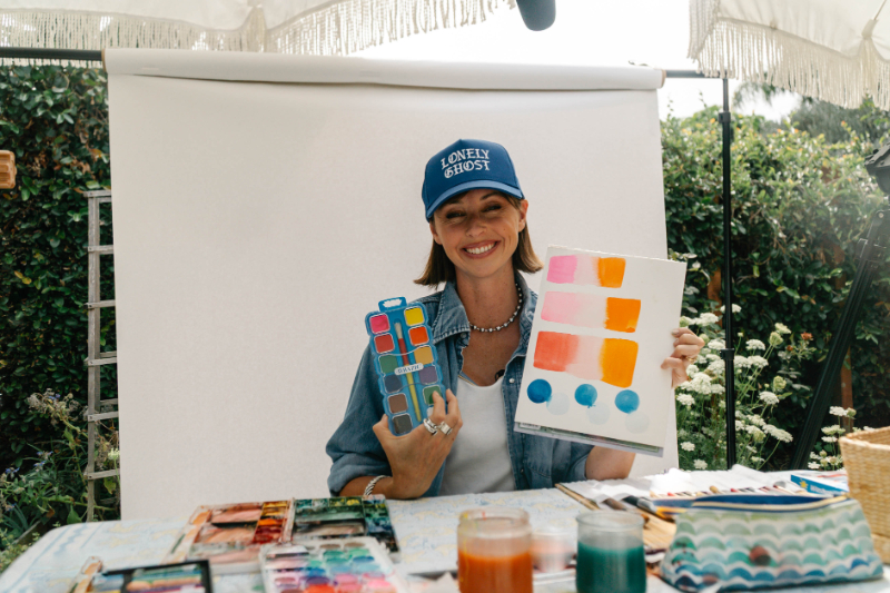
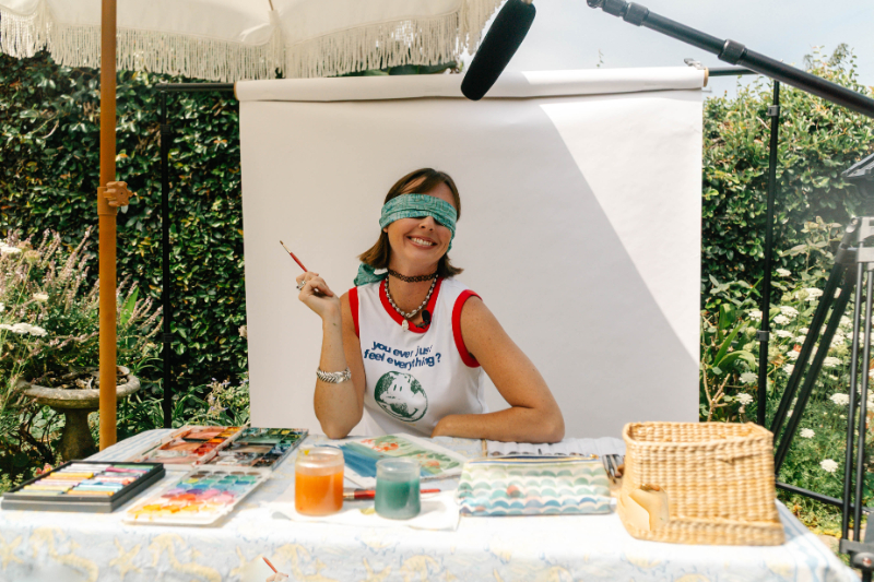
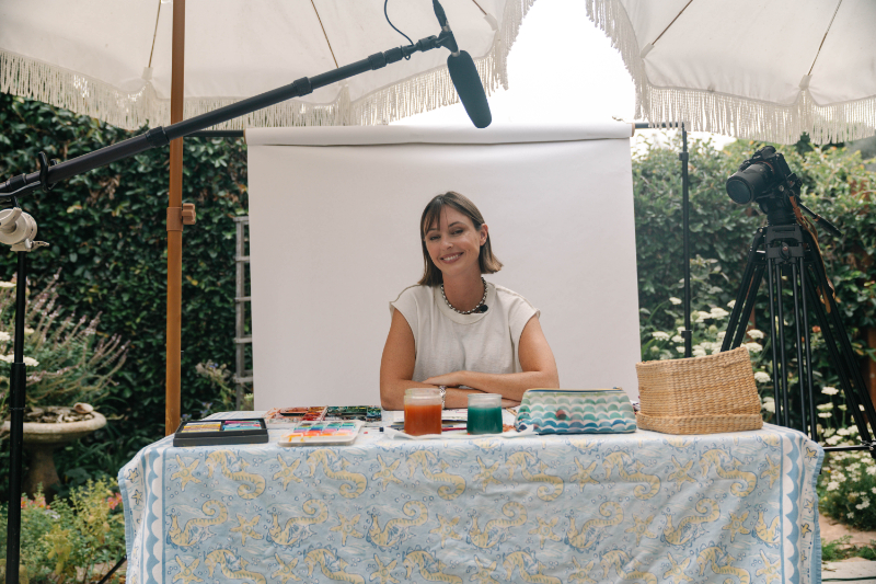
So here's a real one. My videographer, Rachel, painted a beginner floral piece and asked me for honest feedback. Not the vague “aw, it's so pretty!” kind. The useful kind. We filmed the whole thing.
(Watch it first or read first, totally your call. This post goes deeper than the video does, so you'll get something either way.)
Here's the short version if you're skimming: a good art critique looks at four things, in this order. Composition. Shape and dimension. Technical execution. Finishing details. Those are the four lenses I used on Rachel's painting, and they're the four sections below.
And none of this is about what's wrong with a painting. It's about what's next.
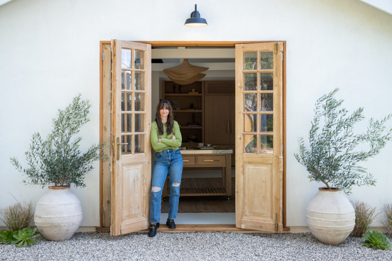
Hi, I'm Jenna
I'm a self-taught watercolor artist, a mom, and the author of the Everyday Watercolor book series with Penguin Random House. I've been teaching watercolor since 2012, mostly through YouTube (300K+ of you over there, hi), online courses, and a whole lot of paintings that didn't work out.
I'm hell-bent on teaching everyone how to find their inner creative voice, and I don't have a lot of rules about how you get there. Create something every day even if it sucks.
Want to work together on something bigger? Brand collabs, licensing, speaking, and the rest live over on my Work With Me page. Or just say hi on Instagram. I read everything.
How Do You Critique Your Own Painting?
Most beginners evaluate a painting emotionally. I like it. I don't like it. That's it, that's the whole review.
Pros evaluate structurally instead. What is the composition doing? Where is the value? Does this have dimension, or is it flat as a pancake?
That shift, from emotional to structural, is one of the most useful things you can build as an artist. It's a skill, not a talent. Which means you can practice it.
Quick trick: step back, squint at your painting, and ask four questions. Is the composition balanced? Do the shapes have dimension? Are the technical bits clean? Is there enough detail, or way too much?
If you want more on the mindset side of this, my post on 7 things I learned from my painting practice this year covers the “observe, don't judge” habit. And my 3-step creative process walks through how I slow down before I ever touch paint.
Lens #1: Is Everything Placed With Intention?
What I noticed
Rachel used three flowers, which I loved. Odd numbers just feel more natural. But her leaves sat in perfect pairs on either side of each stem, and that symmetry made the whole piece feel stiff.
Why symmetry flattens a painting
Nature doesn't do mirror images. When both sides of your painting match, the eye has nowhere interesting to go, so it reads as manufactured instead of alive.
The fix is to break the mirror. Leaf on the left? Give the right side something different. A new angle, a smaller shape, or nothing at all.
The odd-number rule works for more than flowers, by the way. Odd groupings of leaves, stems, buds, and little detail elements all feel more organic.
Then think in S-curves. Your arrangement should lead the eye gently through the painting in an S or C shape, not sit in a tight centered clump.
Try this before you paint: sketch your layout lightly and ask yourself, if I folded this in half, would both sides match? If yes, break something on purpose.
Composition is the thing beginners skip and intermediate painters obsess over. I broke down my full framework (S-curves, odd numbers, focal points) in my floral painting composition tutorial.
Lens #2: Does It Look 3D, or Flat?
This was the meatiest part of the critique, and it's where most beginner watercolor paintings lose their dimension. Three separate issues.
Flower centers: build roundness with value
A flower center painted in one flat color reads as a disc. Not a sphere. A disc.
To suggest roundness, you need a value shift. Lighter toward your light source, darker around the outer edge.
The fix is wet-on-wet. While that center wash is still damp, drop a deeper, more concentrated version of the same color around the outside edge and let it bloom inward. That soft dark-to-light transition instantly reads as a curve.
Bonus option: pointillism-style dots, packed densely at the edge and loosening toward the middle. Gorgeous on coneflowers, sunflowers, and zinnias.
Value control in general is the backbone of this stuff, and I go into it properly in painting watercolor light to dark.
Petals: white space and direction create movement
When every petal is the same size, pointing the same way, with no gaps between them, you get a symmetrical blob instead of a flower.
Two fixes:
- White space. Leave tiny unpainted gaps between petals. It separates them without harsh outlines. Not too much, just enough for the eye to breathe.
- Varied direction. Some petals overlap. Some tuck behind. Some point away from you entirely. That's what makes a flower feel like it exists in space.
One more shift that changes everything: paint at least one bloom from the side or at an angle instead of straight-on. Even a single side-view flower adds instant depth to a composition.
White space and perspective are two of the five things I teach in my 5 principles of watercolor flowers, if you want the full framework.

Stems and leaves: pressure and compound strokes
Rachel's stems were thick and uniform, which flattens a painting fast. Real stems taper. Thicker at the base, thinner at the tip.
The fix is brush pressure. Press firmly at the base and lift gradually as you pull upward. The stroke tapers on its own. Practice it on scrap paper first (seriously, ten minutes of this will change your stems forever).
For leaves, use a compound stroke. Press, pull, and lift in one motion. That gives you the natural almond shape in a single stroke, instead of outlining and filling, which always looks stiff.
I demo compound strokes step by step in sketch and paint watercolor flowers, and there are more brush control watercolor tips in 10 tips to improve your watercolor.
Lens #3: Should You Paint the Background First?
What I noticed
Rachel's sky wash was streaky and uneven, and she'd painted it after the flowers were already down.
Yes. Background first, almost always.
This is one of the most common sequencing mistakes in watercolor for beginners. When you paint your subject first and fill in around it, wet paint hits dry edges and leaves hard lines you never wanted.
Lay your background wash down first. Let it dry completely. Then build your flowers on top. You get one cohesive painting instead of a patchwork.
As for the streaks, that's almost always a water control issue. Usually one of three things:
- Not enough paint mixed before you started
- Going back into an area that had already started drying
- Losing your wet leading edge
Mix more than you think you need, keep that leading edge wet, and move quickly. My watercolor techniques cheat sheet has the smooth-wash troubleshooting section, and color mixing for beginners covers my Tea to Butter consistency scale so you mix the right amount of water every time.
Lens #4: What's the Difference Between “Done” and “Alive”?
What I noticed
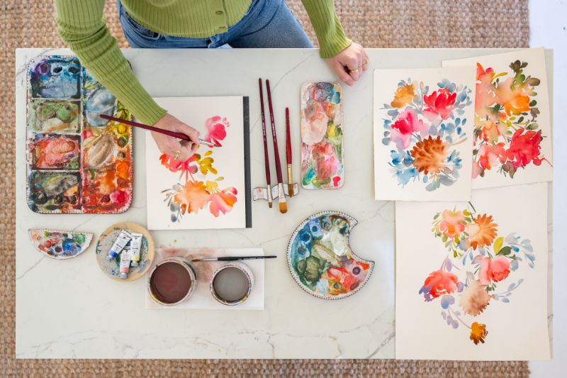
The painting was missing one last layer. Vein detail on the petals, and softer, more irregular petal edges.
Detail is powerful, but only last and only sparingly
Detail added too early goes muddy. Too much of it kills the looseness that makes watercolor worth painting in the first place.
Petal veins: pull a light wash of warm yellow ochre along the petal with a fine round brush. Keep the color close to the petal color, just a touch warmer or deeper. Subtle wins here.
Brush experiment: the side of a filbert brush gives you a more irregular, natural petal edge than the tip of a round. Different tools genuinely produce different shapes, and it's worth a scrap-paper session to see it yourself. (I broke down every brush shape and what it's actually for in my ultimate guide to watercolor brushes.)
Before you call it finished, ask:
- Is there enough dark value contrast somewhere?
- Does any area still feel flat that one more layer would fix?
- Would one or two detail strokes make my focal flower pop?
For more finishing moves, how to add texture to watercolor paintings is the natural next read.
Now Go Look At Your Own Painting
Pull out something recent you weren't thrilled with. Run it through all four lenses. Composition. Shape and dimension. Technical execution. Finishing details.
Then pick one to focus on in your next session. Just one. Trying to fix everything at once is how people end up frustrated and quitting.
And then do it again next time. An art critique is a habit, not a one-time event. The more you look at your work structurally, the faster everything improves.
Want to see the process applied to a bunch of different paintings? I did a multi-submission round in professional artist critiques beginner art.
And if you need something low-stakes to practice on, these are my favorite no-pressure watercolor painting exercises.
FAQ
What is an art critique?
An art critique is a structured review of a piece of art that identifies what's working, what isn't, and specifically how to fix it. A good one is descriptive rather than judgmental. Instead of “the flowers look weird,” it says “the petals are all the same size and facing the same direction, which flattens the bloom.”
How do I critique my own artwork without being hard on myself?
Swap the question. Don't ask “is this good?” Ask “what is this doing?” Look at composition, dimension, technique, and detail as four separate systems. When you name a specific issue, you get a specific fix, and there's nothing left to feel bad about.
Why does my watercolor painting look flat?
Usually it's a value problem. Flat color with no light-to-dark shift reads as two-dimensional. Add a value gradient inside your shapes, vary your brush pressure so strokes taper, and leave a little white space between overlapping elements.
What should a beginner paint first, the background or the subject?
The background. Let it dry fully, then layer your subject on top. Painting a background around an existing subject creates hard edges and streaky washes.
Where can I get my art critiqued?
Local art groups, in-person classes, and online communities all work. I do personalized monthly art critiques inside my Patreon community, where members submit their work and I record feedback on it.

The Real Takeaway
Every single thing I pointed out in Rachel's painting is fixable. Not with talent. With knowledge and a bit of practice.
The distance between a beginner painting and an intermediate one isn't some mysterious artistic gift. It's composition awareness, value understanding, sequencing, and detail control. All four are learnable.
Seeing the issue is already half the battle. Once you can name what's happening on your paper, you can change it.
And listen, this is a hobby. It's supposed to recharge you, whatever your job is and however your last painting turned out. Keep going.
→ Just getting started? Grab The Complete Beginner's Guide to Watercolor. It's a free 40-page e-book covering supplies, techniques, color theory, and composition. Everything I wish someone had handed me in 2012.
→ Ready to go deeper? The Everyday Watercolor Companion Course is the video sidekick to my books, and it's basically like having me sitting next to you while you paint.
→ Want me to look at your work? Join the community for personalized monthly art critiques, plus 50+ exclusive tutorials.








+ show Comments
- Hide Comments
add a comment