


Color is a language our soul and emotional bodies just get. There’s no explaining why you have a physical response to looking at art, or the deep, midnight blue sky at night other than that color communicates with us on an emotional level and transcends information and knowledge. Beyond this too, color is a powerful tool in design, art, and everyday perception. It's not just about hues but also color temperatures and undertones. These elements can dramatically alter the mood and feel of a space or artwork. This post delves into the intricate world of color temperatures and undertones, illuminating how they influence our perception of color.
Related: Color Theory and Why It Matters In Art
Part 1: The Basics of Color Temperatures
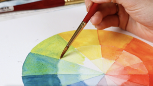
Color temperature refers to the warmth or coolness of a color. It’s a characteristic that can change the atmosphere of a space or piece of art. There’s a lot of confusion and mystery around which colors are warm vs. cool, and the best place to start is always the color wheel.
The color wheel is split into two sections: Warm and Cool Colors. First, let’s define the difference between these two groups:
Warm Colors: These are hues with red, orange, or yellow undertones. Warm colors are often associated with energy, passion, and coziness. They can make large spaces and pieces feel more intimate and small spaces and paintings more inviting.
Cool Colors: Hues with blue, green, or purple undertones fall into this category. Cool colors are linked with calmness, serenity, and spaciousness. They're ideal for creating a tranquil and open atmosphere in a painting or space.
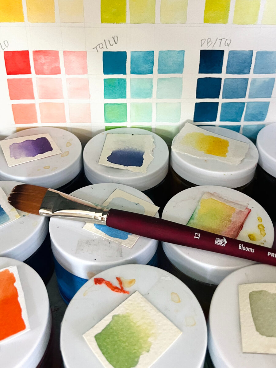
But it doesn’t just stop there! Yes, it gets slightly more complex because there are some colors like French Ultramarine for example that are the color blue, but because of the color temperature bias, this color is actually considered a warm color.
Why is this?
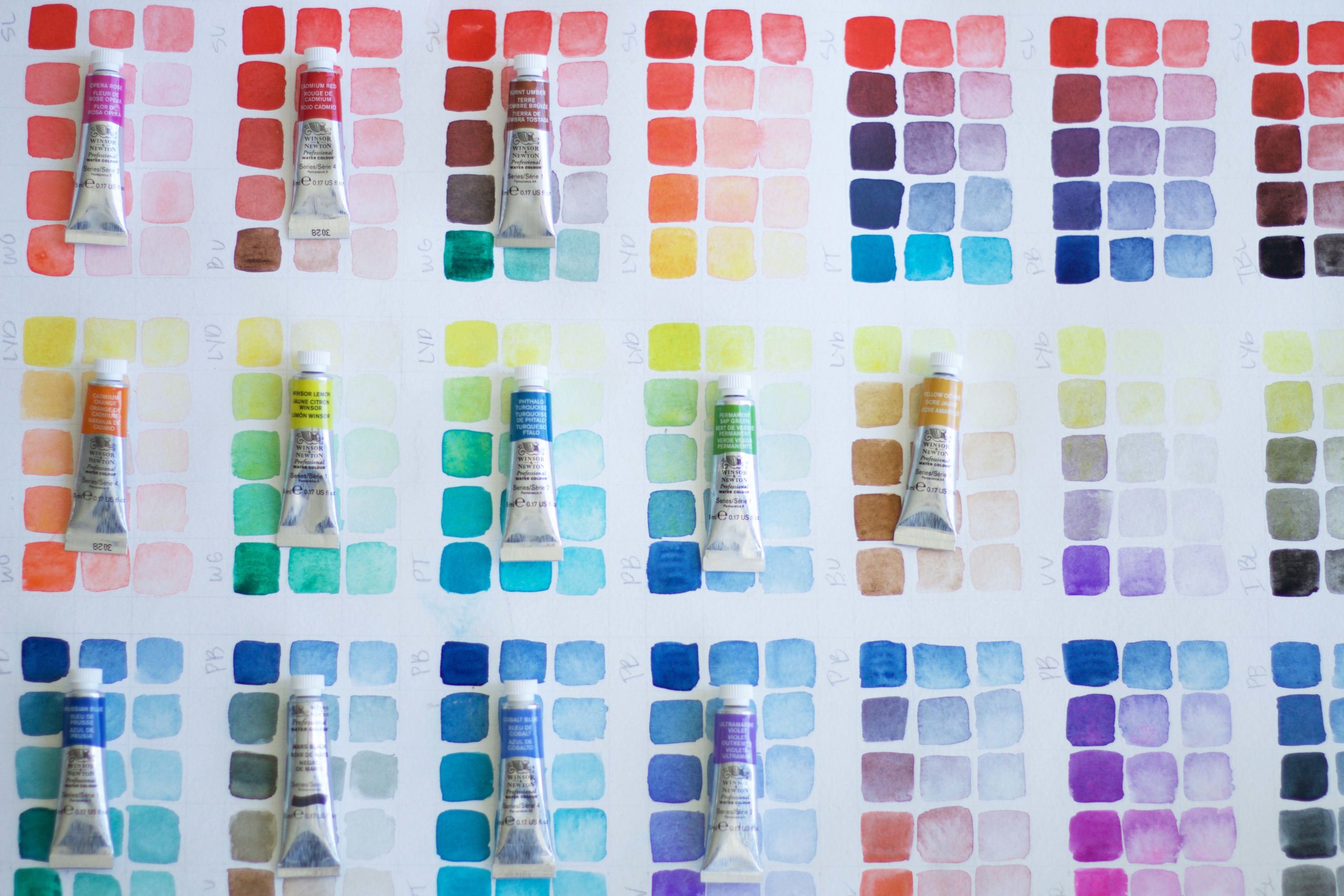
With every color, whether it’s red, blue, yellow, purple, etc. you have a bias.
Color Bias: Color bias in watercolor pigments refers to the subtle leanings of a color towards another hue in the color wheel. For instance, a blue pigment might have a slight green or purple bias. For instance, French Ultramarine leans more towards purple rather than green, making it a warm bias because purple is moving toward the direction of red vs. green which is going deeper into blue and yellow on the color wheel!
Why is this important?
This bias affects how the color mixes with others, influencing the resulting hues. Understanding color bias is crucial for artists to achieve the desired color mixtures and effects in their work. It's a key aspect of color theory that helps in creating more nuanced and harmonious color combinations in watercolor paintings.
I know several artists who only work with warm bias colors because they prefer the inviting, warm feel in their work!
Part 2: Understanding Undertones
Undertones in watercolor pigments refer to the subtle, underlying colors that are not immediately apparent but influence the overall hue. For example, a red pigment might have a blue or orange undertone. This affects how the color interacts with others when mixed, impacting the final appearance of the painting. This is why I prefer mixing my purples with Opera Rose or Quinacridone Red (cooler pink) because it makes really rich and vibrant purples vs. Scarlet Lake or Permanent Red Light (orange undertone reds) because it makes the mixture more dull.
Identifying and understanding these undertones helps artists create desired effects and more complex color palettes. For instance, a red with a blue undertone can produce richer purples when mixed with blue, compared to a red with an orange undertone.
Neutral Undertones: These undertones provide balance and flexibility. Colors with neutral undertones can fit into various settings without overpowering other design elements.
Saturated vs. Muted Undertones: Saturated undertones are vivid and intense, bringing energy and vibrancy. Muted undertones, on the other hand, offer a subdued and sophisticated feel.
Part 3: The Interaction of Light and Color
The perception of color temperature and undertone is heavily influenced by lighting. Why is this? Well, within all kinds of light, natural and artificial, there are undertones, biases and a full spectrum of colors!
Natural Light: It brings out the truest form of color, revealing subtle undertones and the actual warmth or coolness of a hue.
Artificial Light: Different types of artificial lighting can enhance or alter color temperatures and undertones. For instance, LED lights tend to bring out cooler tones.
Color temperatures and undertones are more than just aesthetic choices. They are tools that affect our emotions, behaviors, and perceptions. Whether you’re an artist, designer, or simply someone interested in the psychology of color, understanding these concepts is key to harnessing the true power of color.
Color biases, temperatures and undertones are so helpful to understand when mixing colors so you can create palettes and combinations of colors that you are truly inspired by!
If you want some more helpful information on this topic, I cover this in the intro portion of my course Everyday Watercolor Companion Course!


Thank you for this thorough yet plain language explanation of color theory, Jenna! Sometimes it seems like color theory is reserved only for the chosen few who attended art school. This was great!