What is color theory, you ask? Well, according to Wikipedia, “In the visual arts, color theory is the body of practical guidance for color mixing and the visual effects of a specific color combination.”
Understanding how colors correspond with one another (aka color theory) has been THE biggest transformation for me and how I paint. Knowing which colors to mix up and what to paint and when to create harmony has built so much confidence. It's allowed me to progress with art much faster than before.
Related: Color and Trend Research for Surface Pattern Designers
What is Color Theory? And Why It Matters in Art
The Color Wheel
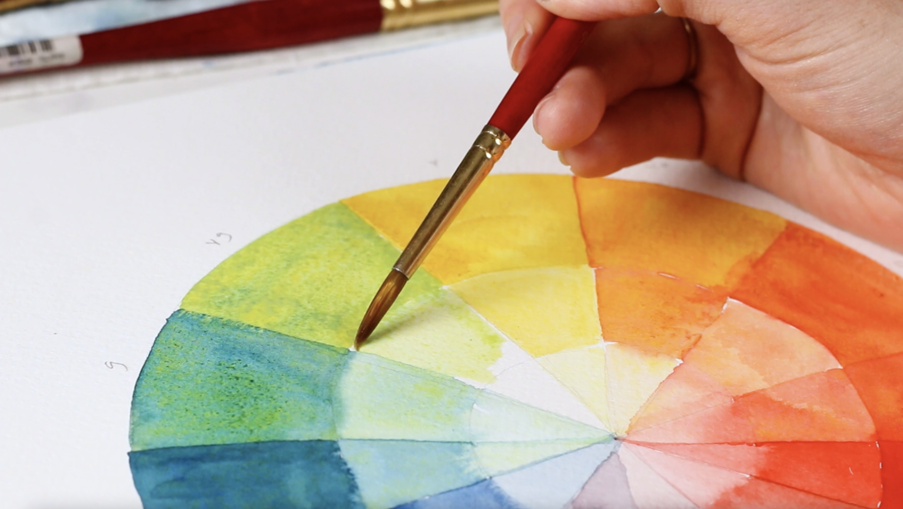
To get a good grasp on color theory and relationships, we must look to the color wheel. The color wheel is an extremely helpful resource for crafting custom palettes and understanding which colors to use and when. When I started studying the relationships between colors and what combinations are harmonious and which ones would cause strain or disharmony, the game completely changed.
To get familiar with a color wheel, let’s break it down real quick, shall we?
Primary Colors: the 3 pigment colors that cannot be mixed or formed by any combinations of other colors. All other colors are derived from the 3 hues red, blue and yellow.
Secondary Colors: the colors formed by mixing two primary colors which includes orange, green and violet.
Tertiary Colors: the colors formed by mixing a primary and a secondary color. These have a hyphen in the name, for example, red-orange, yellow-orange, red-violet, blue-green, etc.
Contrasting or Complimentary Colors
These are located directly across from each other on the color wheel. When mixed together you can mute or desaturate the strength of the colors, making it more brown, black or gray.
If I use red and green, for example, ineffectively with each other in the same piece, it can cause too much strain and competition and will force people to look away from the piece. With contrasting colors, as I mentioned before, one color in the combination will always be warm and the other cool. This is because when we look at the color wheel and split it in half from violet to yellow and in between are the cool colors on a color wheel. Then from red-violet to yellow are the warm colors! So if you’re ever unsure of which cup of water to rinse off a specific color, refer back to this color wheel!
Why Is Color Theory Important?
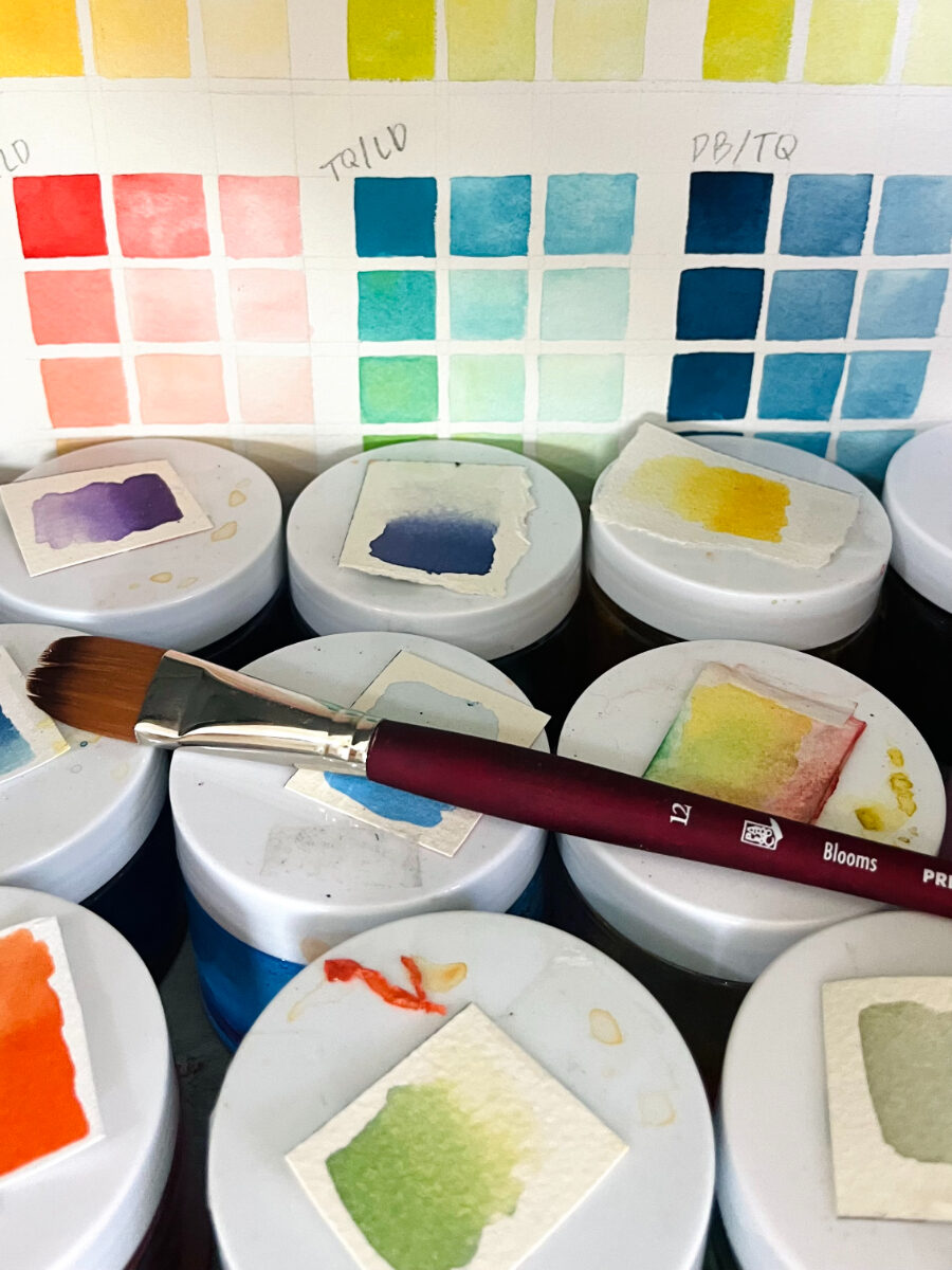
Color theory is important because it's crucial to know how to mix a custom palette, how to match colors and the reasons why warm and cool shades can affect the mood of a piece. It's also a total superhero trick to be able to replicate colors you see in real life on your paper!
There is SO much more to colors and color theory, so if you want an in-depth look at the topic, check out this video!!






HI ! this was super helpful! I’m often confused how to get my pieces to looks attractive!
thank you !