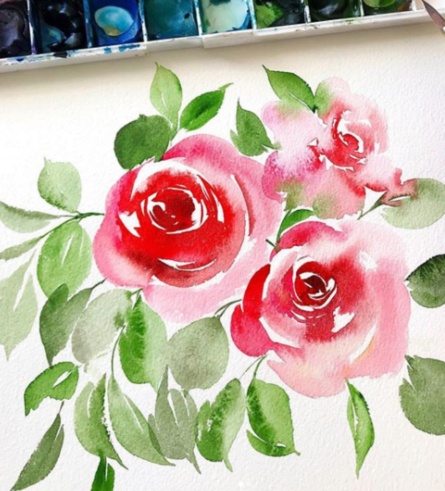
For the longest time, I thought being a surface pattern designer just meant painting the same florals over and over and calling it a day. Or maybe getting some creative direction from the manufacturer and coming up with a few prints.
WRONG.
As a surface pattern designer, one of the biggest steps in creating work that will get picked up and do well is: color and trend research! I’ve always been a big fan of color. I believe one of my biggest skill sets as an artist is having a great eye for color and combinations through studying color theory!
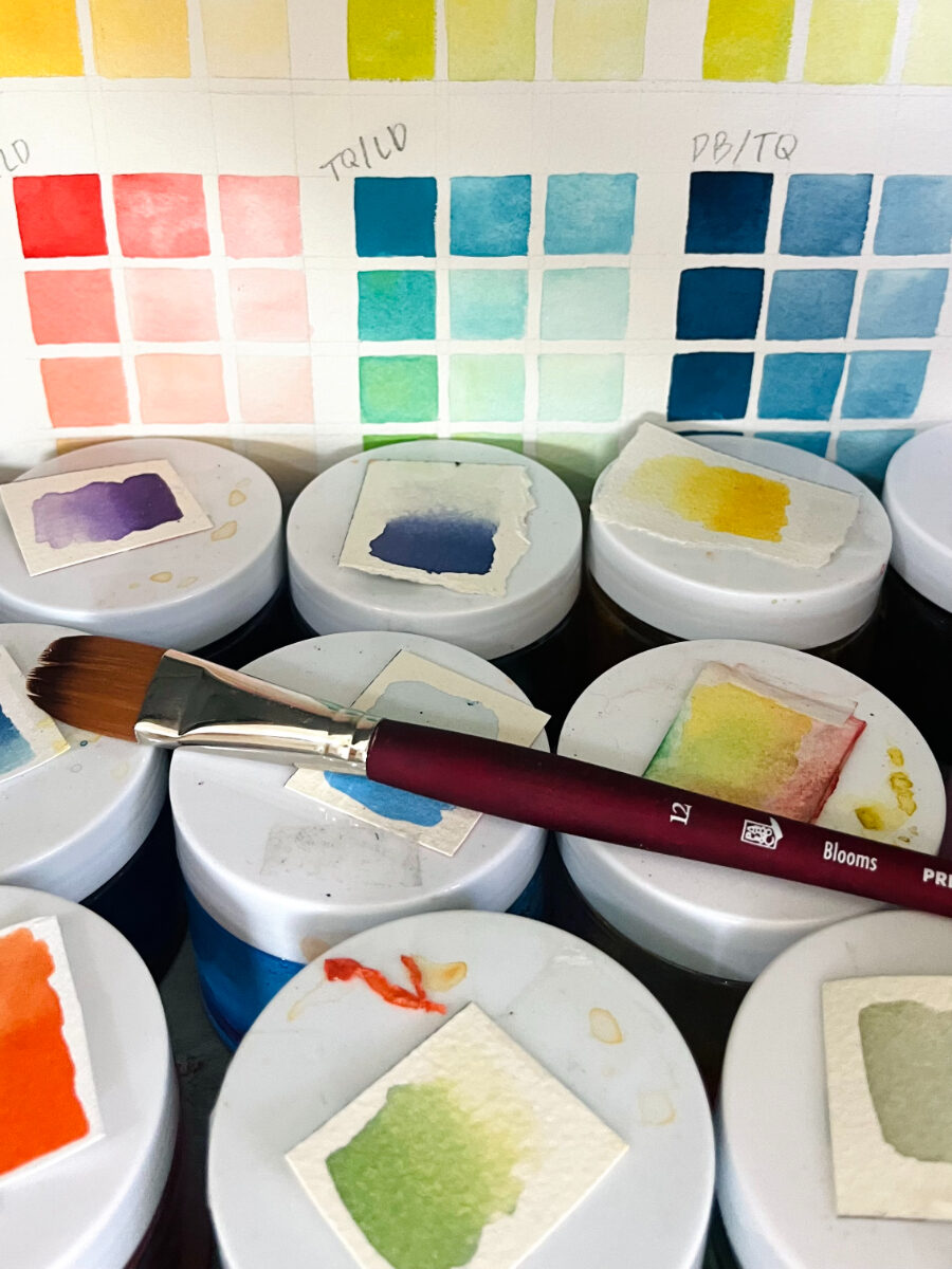
Related: How to Paint a Color Chart
As an artist I would study colors, build palettes that created harmony and capture the emotion or season I was in while painting. But as a surface pattern designer, there was always a bit of disconnect between creating prints and patterns and capturing a theme through color.
So, what do I mean by color and trend research?
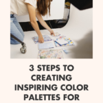
3 steps to inspiring palettes on trend
Pinterest, baby
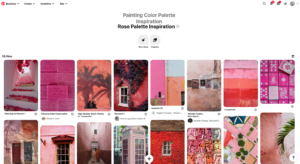
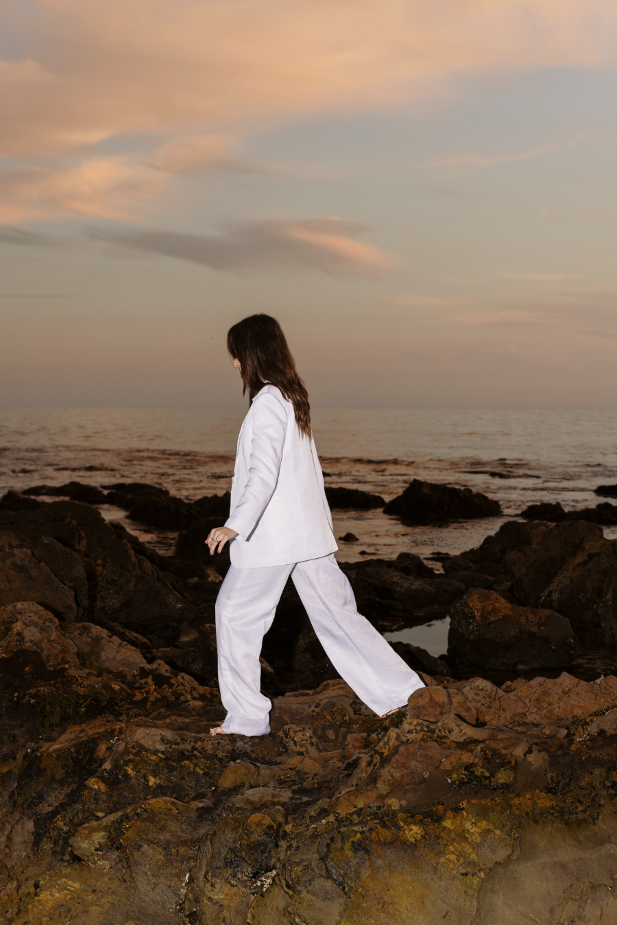
I talk about Pinterest quite a lot on here. If you’ve been reading my blog for a while, then you’ll know it’s one of my favorite marketing tools. Why? Because it helps you get in the minds of your customers/clients and is an amazing tool for inspiration. But did you know that a lot of my color palette inspiration for new collections comes from looking up travel photos and professional photographer’s pages? I use them to group images by colors on boards!
In this board on my Pinterest I have sections dedicated to “Yellow,” “Green,” “Blue,” etc. to really get my mind spinning with ideas and combinations for colors. But before I really narrow down my color palette for a specific collection, I’m thinking about theme and trend.
Theme
Is this collection for a specific product category? Home goods? Baby? Tech? If so, think about the surfaces these prints and patterns will go on. Research that category on Pinterest and other places like TrendBible for some trend research help. For example, in forecasting and coming up with patterns for the year 2022 in the home goods category, I know I’m going to want to move to a lot of earth tones and neutrals for my prints. After 2020 and the year we had spending a lot of time at home, people are looking for ways to make their home more calming, peaceful and like a retreat. This helps to inform the types of elements I paint. It also informs the choices I make when it comes to colors, textures and more!
Sketch and Play
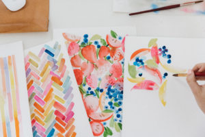
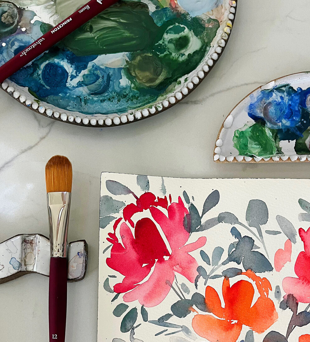
One of my favorite things to do before I start painting elements for a specific licensing collection is to sketch out ideas and paint little moons with each color in the collection. These colors and sketches are used as reference points to always come back to while I’m painting!
There is SO much more to trend research and developing a full licensing business, so that’s why we put together the course Brand Plus Brand. This course is taught with my licensing agent Julie Turkel and covers all the steps to starting and growing a licensing business. Check out the course details HERE and sign up for the waitlist to be notified when the doors open for registration!




+ show Comments
- Hide Comments
add a comment