Have you ever wondered how to set up your files for print? Or maybe you've been working with a print shop, your fonts printed weird, or a piece of artwork didn't shop up?
That's all happened to me before! For the first 6 years of running my business, I offered custom stationery design to wedding clients, and the horror stories of letters disappearing in files, or invitations coming back different than the file I sent to the client…SO MANY MISTAKES. And let me tell you, because I shared an office with a print shop, SO MANY DESIGNERS have no clue how to properly set up their files for print. I'd overhear them talking about designer clients with the wrong file set up DAILY, and it wasn't just beginner designers! We're talkin' well-seasoned designers.
So, without further ado…
5 mistakes designers makes when preparing files for print
1. Fonts aren't outlined
When you're in Adobe Illustrator and you hover over an area of text and the underscore pops up, that's a font. Fonts can be downloaded from websites and installed into Adobe programs, and if the print shop doesn't have that specific font you used in your design, Adobe will automatically populate it with a default font on their end. Which is bad. If they don't catch it, they could end up printing your wedding invitations, posters, whatever WITH THE WRONG FONT. Make sure to outline your fonts so this doesn't happen!
2. Blacks aren't 100% black
This isn't necessary for digital printing, but for artwork that is scanned in and is made to be letterpressed or foil printed, you need to make sure your blacks are 100% black. This is so that when your artwork is burned onto the plate for these printing methods (or screens if you're opting for screen printing), every bit of it is picked up. A lot of the time there will be gray areas around art that you can't see unless you zoom in close. Those gray bits will not be burned onto the plate!
3. Where are the bleeds!
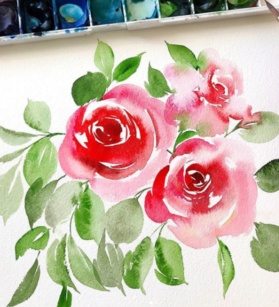
If you want artwork to run off the page, you need at least a .125″ bleed area around your artboard. For example, let's say you want the watercolor florals to go all the way to the edge of the paper. In your file, you need the actual art to go to the edge PLUS .125″. This is so if any shifting happens during print, there won't be any weird gaps of blank paper between your artwork and where the paper is being cut, or the edge!
4. Wrong color mode
Do you know the difference between CMYK and RGB? Well, quick tip: CMYK is for print. If you send a print shop a file that is in RGB color mode, your work will come out looking quite different than what was on your screen! Make sure you scan in artwork and design your files under CMYK if they're going to be printed!
5. Images/artwork isn't embedded
Sometimes photographs and artwork that is in jpeg format, like watercolor, will just disappear in a file when it's opened on another computer. Make sure before you send your files to a printer, that you are embedding these images! This ensures when your file is opened elsewhere, it shows up and is printed! I've had files printed that were missing big chunks of artwork before. Don't let this happen to YOU!
There you have it! 5 mistakes every designer makes when preparing files for print. Not only will these 5 fixes make your printer LOVE you, but it will help you avoid paying for mistakes and oversights out of pocket.
If you want tutorials on how to prepare your custom stationery files for print, check out my course Pen to Press where I go into detail in video! This course covers the entire process of designing custom stationery from scanning, designing, mock-ups, prepping files and more! For just prepping your art prints to sell, you might like Prep for Print!


Dang! Good Advice! Thanks, Jenna
thank you! Glad it was helpful 🙂
Hi Jenna
What printer do you use?
I currently send everything to a print shop, but I’m testing a printer actually for home printing so stay tuned!
You make sense…but how long and how much are these courses?