


Let’s be real. Styling photos of your artwork feels like a different language.
And all the influencers and bloggers out there seem to have it dialed—from the lighting to the composition, to the editing…
Creating scroll-stopping images that help you stand out from the crowd ain’t no thing, I get it, but there’s actually some really simple ways of breaking it down, so I’m gonna give you 3 tips for styling photos of your artwork to help you out.
Before we get there though, why does this matter?
From my days as a wedding and portrait photographer (yes, I know how to shoot manual and style photos with a DSLR, but this is all about smartphone tips!), I learned that having “an eye” for photography and composition doesn’t always come naturally to everyone. Just like anything, it takes practice and seeing things in a different way.
There’s a lot of “meh” photographers out there and there’s a lot of “good” photographers out there. But, what makes the great photographers stand out? It’s their style, the way they compose and capture the shot. The way they create and develop the scene. Which brings me to my first tip…
3 Tips for Styling Photos of Your Artwork
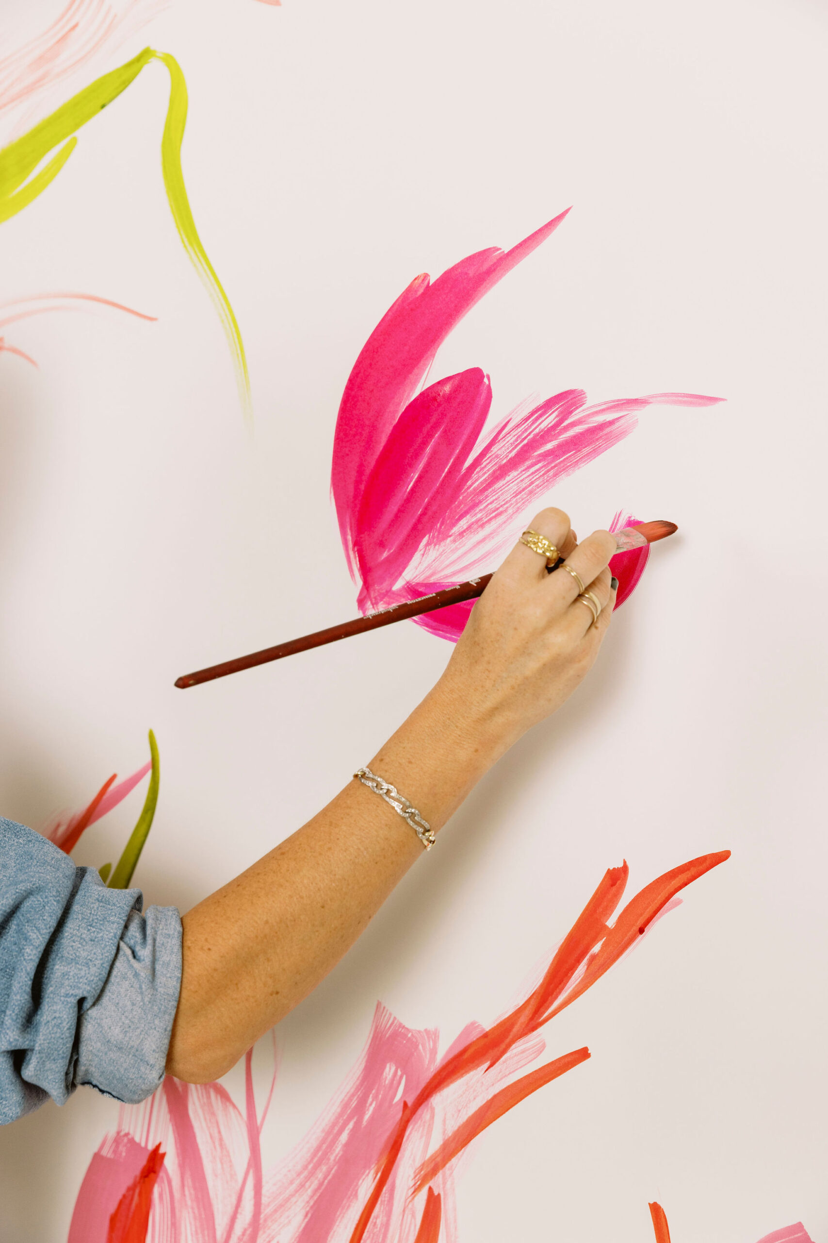
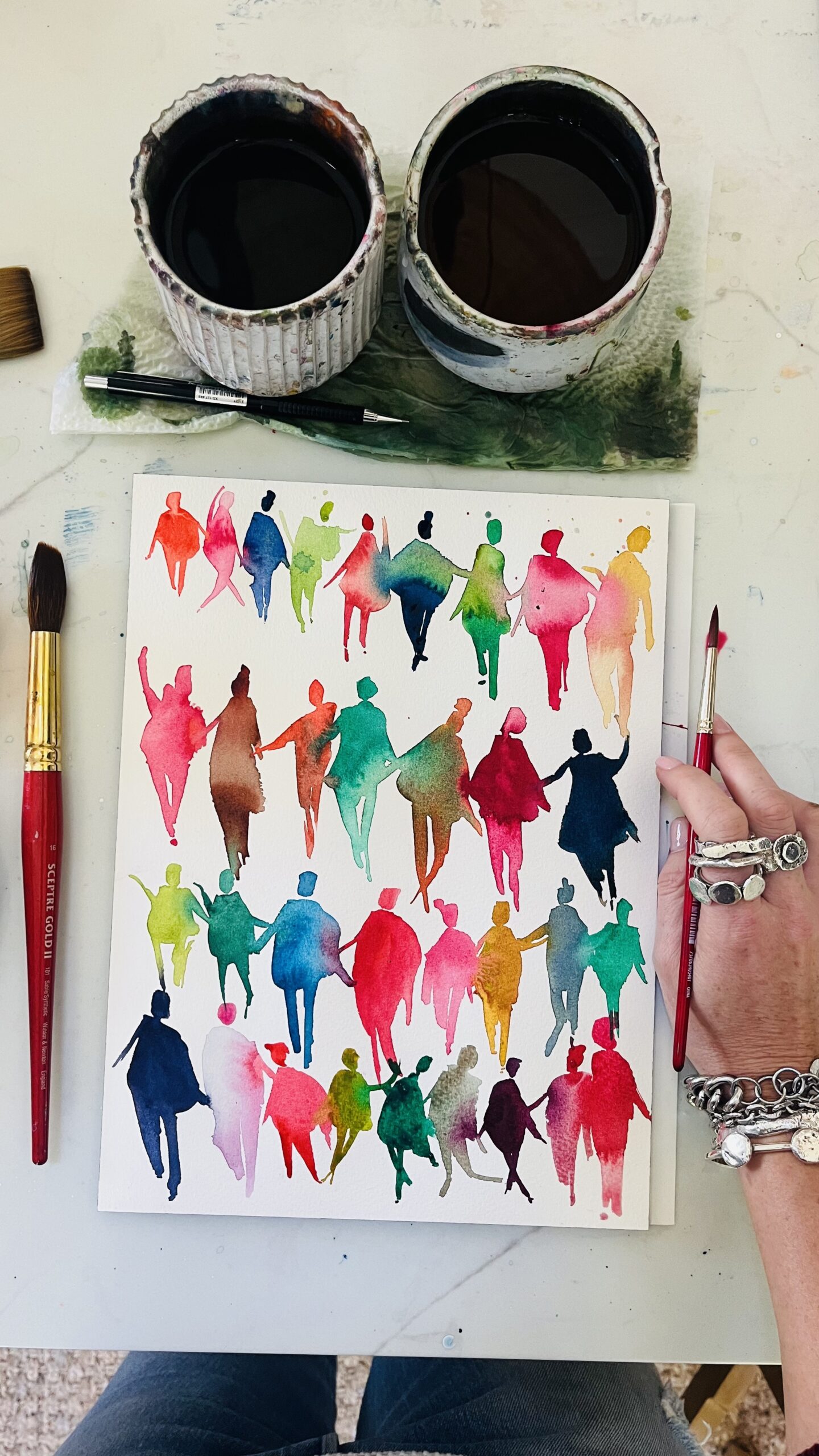
Tip #1: Add dimension
Whether this is through depth of field using portrait mode or lifting a subject in your flat lay so it has more shadow, dimension creates more depth and a deeper shadow! And it’s so simple! Just place one of your objects on top of a stack of cards, or a matchbox…something that will give it some lift above the rest of the objects. Make sure the shadow isn’t too overpowering or hiding another object in your flat lay, but is there to move the image from 2 dimensional to feeling 3 dimensional to the viewer! The same can be done when you shoot in portrait mode like the image below!!
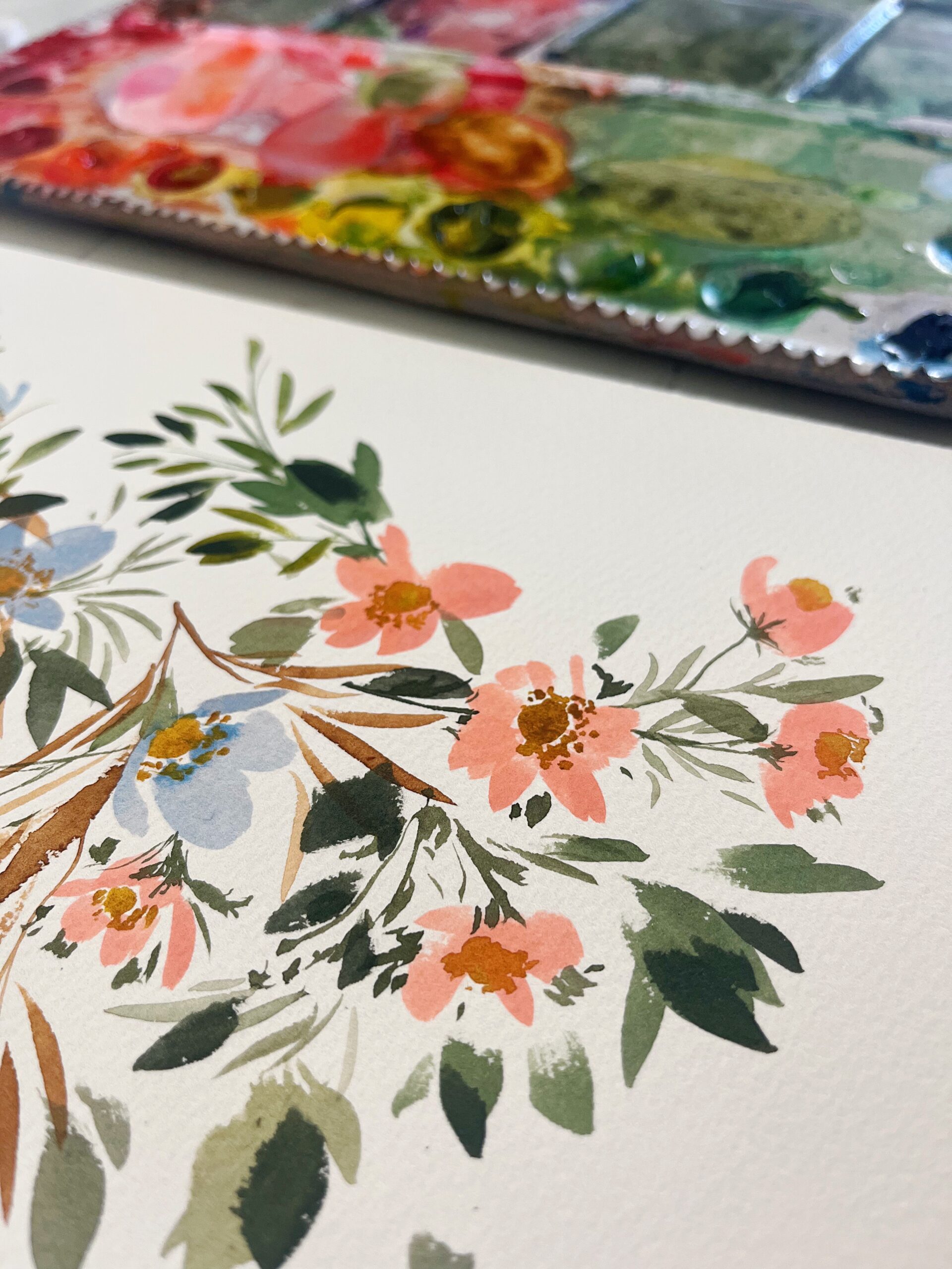
YES! This was shot on my iPhone!!
Tip #2: Create a Theme
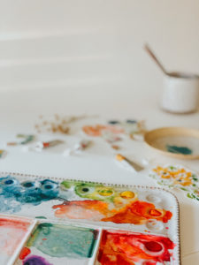
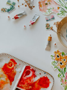
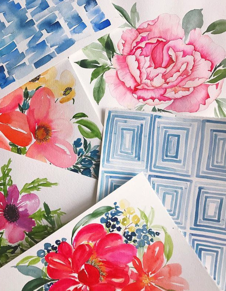
In the image below, I wanted to showcase my wildflower paintings. I used some props like dried flowers and more natural looking elements like my ceramic palette from Sylvan Clay Works, vintage floral stamps and this handmade dish with pigment in it.
Throwing in a fancy gold watch or something more modern or bold in color would throw off the whole theme. Choose your main subject and pull out the aesthetic and theme based off of what you’re shooting!
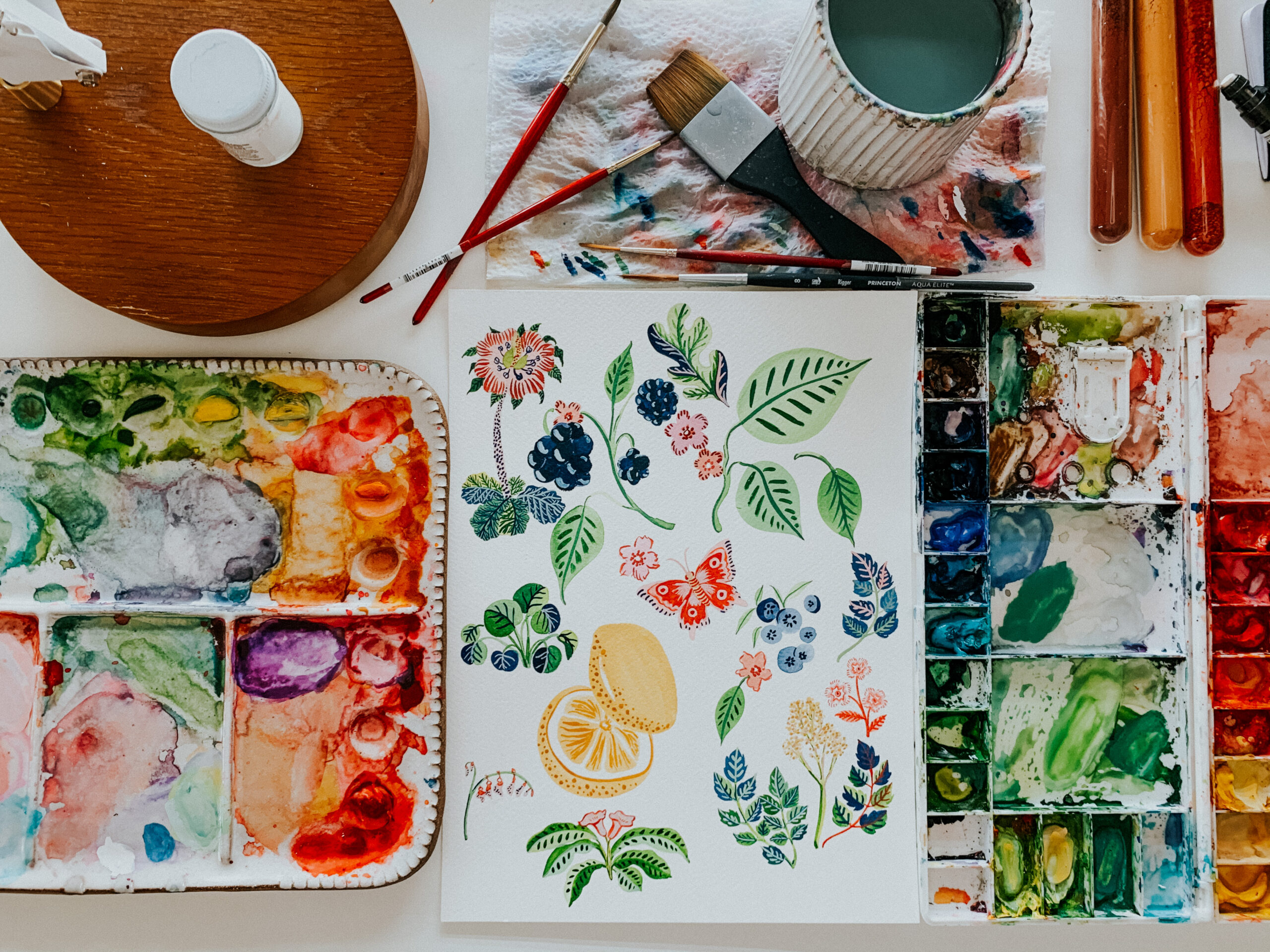
Tip #3: Start With the Big Props First!
If you’re stuck in the *straight down, overhead shot of my painting/artwork, with nothing else going on* shot, I get it. Styling shots of your artwork with multiple elements seems complicated and overwhelming. But, this is the key to scroll-stopping images.
Most artists on Instagram or with online shops and product photos are posting boring AF images. I’ve been there! It’s quick, it’s easy! But styling images like the ones above are TOTALLY accessible and when you get the methods down, incredibly quick as well. And that little bit of extra effort can really make a huge difference to your online shop, your Instagram feed, your portfolio and more.
AND the best part?? You don’t have to hire a professional photographer to get professional looking photos of your work! You can do it all with the tools you have at home and your smart phone! Boom.
So, when you’re styling an image like the one above, start with the big props FIRST! If I were to start my composition with the little stamps and tubes of paint, I’d be overwhelmed. It’d take me so much longer to actually see the composition for this flat lay. Let the big props take up the majority of the white space first, then it’s not as scary or intimidating!
Take it to the Next Level
Like those tips? I made an online course on styling, composing photos, lighting, editing your images, etc. called Photograph Your Artwork that goes into depth on my process for shooting, styling and editing all of these photos.
- I break down the process of composing your shot in 2 easy methods that will change the way you look at styling.
- I’m giving you my 25 editing presets for the Lightroom Mobile app, so you can just tap and post your photos.
- I show you how to find and work with the best natural lighting, what time of day to shoot and how to bounce light to make your shot better
- And MORE!
All of those tricks I learned as a pro photographer, packed into a course for smartphone photography and made easy and accessible to grasp, no matter how much skill you might be lacking in this department!
Check out all the details on the course here and start creating images of your work like a pro!


")


Dear Jenna,
Your blog is exceptional, lovely, and informative.
As an artist, I strive for perfection.
Thank you for the tips as per iPhone and capturing one’s art.
Faboo!,
Phyllis
Yay! I’m glad it was helpful!
I have heard this tip before about using portrait mode, but unfortunately there is no portrait mode on my Android phone. I don’t have any specific settings on my phone’s camera. Any suggestions what to do without portrait mode?
Try shooting the photo directly in the Lightroom app (instead of the camera app) and adjust the aperture in there!